WEBSITES FOR COMMUNITY ORGANISATIONS
Victoria Court Residents Association
This residents association visualised a website as a means of doing away with printing and distributing newsletters, minutes of meetings, financial statements, etc. while at the same time keeping a permanent and readily-accessible store of all of the association’s documents.
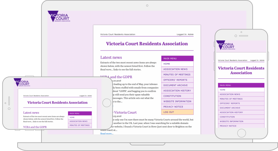
- Custom design. My central design idea for the site was to have it look rather like a newsletter. The result is what appears to be a sheet of paper in the middle of the screen, on which all of the content is presented. The newlsetter concept influenced my choice of typeface, opting for a solid, traditional serif; and the fairly monochrome colour palette, based on shades and tints from the purple of the logo.
- Responsive layout. The web page layout is fully responsive; it automatically adjusts and adapts to any device screen size, be it a desktop computer, a laptop, a tablet, or a mobile phone.
- Content and architecture. The association already had four core, established types of material that it circulated to its membership, so that suggested a very obvious structure and key sections for the site. We supplemented those with others to deal with the organisation’s history and its constitution.
- Logo and related work. The association didn’t have any recognisable “identity” — documents had been produced in a variety of styles and formats. Developing the website lent some focus: I designed a logo for the site, and took that forward to produce “branded” letterhead and email formats.
- Domain registration, hosting and maintenance. I took care of domain name registration for the association, and the website is hosted on a DECEMBER14 web server. I also provide maintenance services as required.
What the client said
“Lovely, clear, easy-to-use design; highly legible text (good for those of us whose eyesight isn’t what it used to be); works great on mobile phones too. Adding and updating pages is a doddle. A really worthwhile resource, thanks to fine work by Keith.”
Visit the website
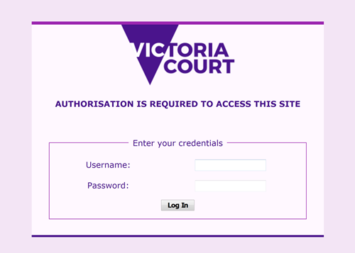
Well, actually… no. Sorry, but you’ll have to make do with the screenshots above to get a flavour of how the site looks. Access to the site is restricted to members of the association, who log in with individual usernames and passwords.
DECEMBER14
→ Case studies → Websites for community organisations